Create Effective Websites
How to make your website look and feel gud.
Color Theory
Colors and Meaning
| Color | Meaning | Example |
|---|---|---|
| red | love, engergy, intensity | cars |
| yellow | joy, intellect, attenction | beach body |
| green | freshness, safety, growth | groceries, food |
| blue | stability, trust, serenity | finance, crypto |
| purple | royalty, wealth, femininity | payday loans, things for women |
Combining Colors
Two colors right next to each other on color wheel
- Nav bars, logo and background
- Doesn't stand out
Two colors opposite on color wheel
- Logos, icons
- Compliments - it pops and brings things out
Equilateral triangle, or square
Color Resources:
https://color.adobe.com/create/color-wheel
Typography
You want to pick fonts with a similar mood and time era.
You want to contrast serif-ness and weights.
Serif and Sans-serif
Two main types of fonts:
Serif
- Have little "feet"
- Inspired by old marble text carvings
- Looks more serious, authoritative, old timey
- Good for letterhead for legal company, magazine for architecture
Sans-serif
- no little "feet" on characters
Font Types and Uses
Serif - traditional, stable, respectable
- Ex. Merriweather, Bitter, Domine, Minion Pro, Trajan, Baskerville
- Used in "Vouge"
Sans-serif - sensible, simple, straightforward
- Ex. Open Sans, Noto Sans, Montserrat, Roboto, Helvetica, Avenir, Din
- Open Sans Condensed is good for headers
- Used in startups, body text
- Sub Families:
- Humanist sans serif - much more "friendly" and easier to read
- Ex. Open Sans, Gill Sans, verdana
- Grotesque sans serif - harder to read
- Ex. News Gothic
- Humanist sans serif - much more "friendly" and easier to read
Script - personal, creative, elegant
- Ex. Freestyle Script, Adios Script Pro, Snell Roundhand Display - friendly, loud, amusing
- Ex. Vag Rounded, Gin, Thirsty Rough Modern - stylish, chic, smart
- Ex. Sackers Gothic, Gotham, Futura
My Favorite Fonts
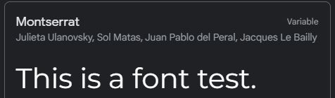
Montserrat (sans serif)
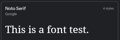
Noto Serif
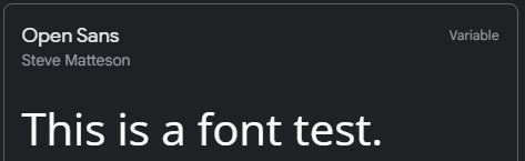
Open Sans
Effective UI
UI is User Interface. Manage attention with effective UI.
Define your hirearchy of what you want the reader to give attention. Most important should be conveyed first. Define by:
- Colors that pop
- Size - larger stands out more
- Layout - keep it interesting
Aim for 40-60 characters wide for text blocks.
Keep alignment the same for the same sections.
- Ex. between header and text
- Reduce the number of alignment points overall
Space things out - use whitespace - it makes things look more expensive.
Design for your audience.
- Ex. make it fun if it's for kids
UX Design
UX is User eXperience. Make it easy for the user to do what they want to do.
Simplicity
- Keep it simple, stupid!
Consistency
- Keep the functionality of the product similar between parts of the website
- Ex. keep the nav bar the same
- Keep the functionality of the product similar between parts of the website
Reading Pattern
- Use the F-Layout - people start at top left, read to right, then down left, then right, then down left, etc
- Or the Z-Layout - start top left, then top right, then bottom left to bottom right
All Platform Design
- Websites have to work on all platforms!
- Mobile first design - most people view websites on mobile now
- Don't have a ton of banners on mobile
Don't use your powers for evil
- Don't use dark patterns - things that are good for company but bad for user that you try to get user to do
- Don't be a Ryanair, or a time-share salesman